Legal Icons for Courts

Legal Icons for Courts

Legal Icons for Courts

At Transcend Translations, I initiated the development of the first universal icon set for court systems, as well as the redesign of the icon website.

At Transcend Translations, I initiated the development of the first universal icon set for court systems, as well as the redesign of the icon website.

At Transcend Translations, I initiated the development of the first universal icon set for court systems, as well as the redesign of the icon website.

A mockup of the legal icons website on a laptop. Screen says Free, field tested and easy to user for print and web. Includes a search and browse option.

Contributions

UX Design

Icon Design

Team

I worked with a senior designer, design manager and subject matter expert.

Timeline

2 years

Summary

Scroll ↓

Judicial Council of California 1926 seal

Context

Our client asked for icons and phrases to improve the clarity of courtroom signage.

At Transcend Translations Inc., a readability and translation agency, I contributed to a project for the Judicial Council of California to improve court signage. My role as a junior designer was to source the necessary icons for the plain language terms my company developed.

Legal Icons of different styles

Problem

Universal icons for courts and the legal industry did not exist.

I quickly realized a universal and consistent set of icons for the legal industry did not exist.

I quickly realized a universal and consistent set of icons for the legal industry did not exist.

I quickly realized a universal and consistent set of icons for the legal industry did not exist.

I quickly realized a universal and consistent set of icons for the legal industry did not exist.

So I wondered:

How are abstract concepts visualized as recognizable icons, and how can my agency leverage its expertise to create them?

Outcome

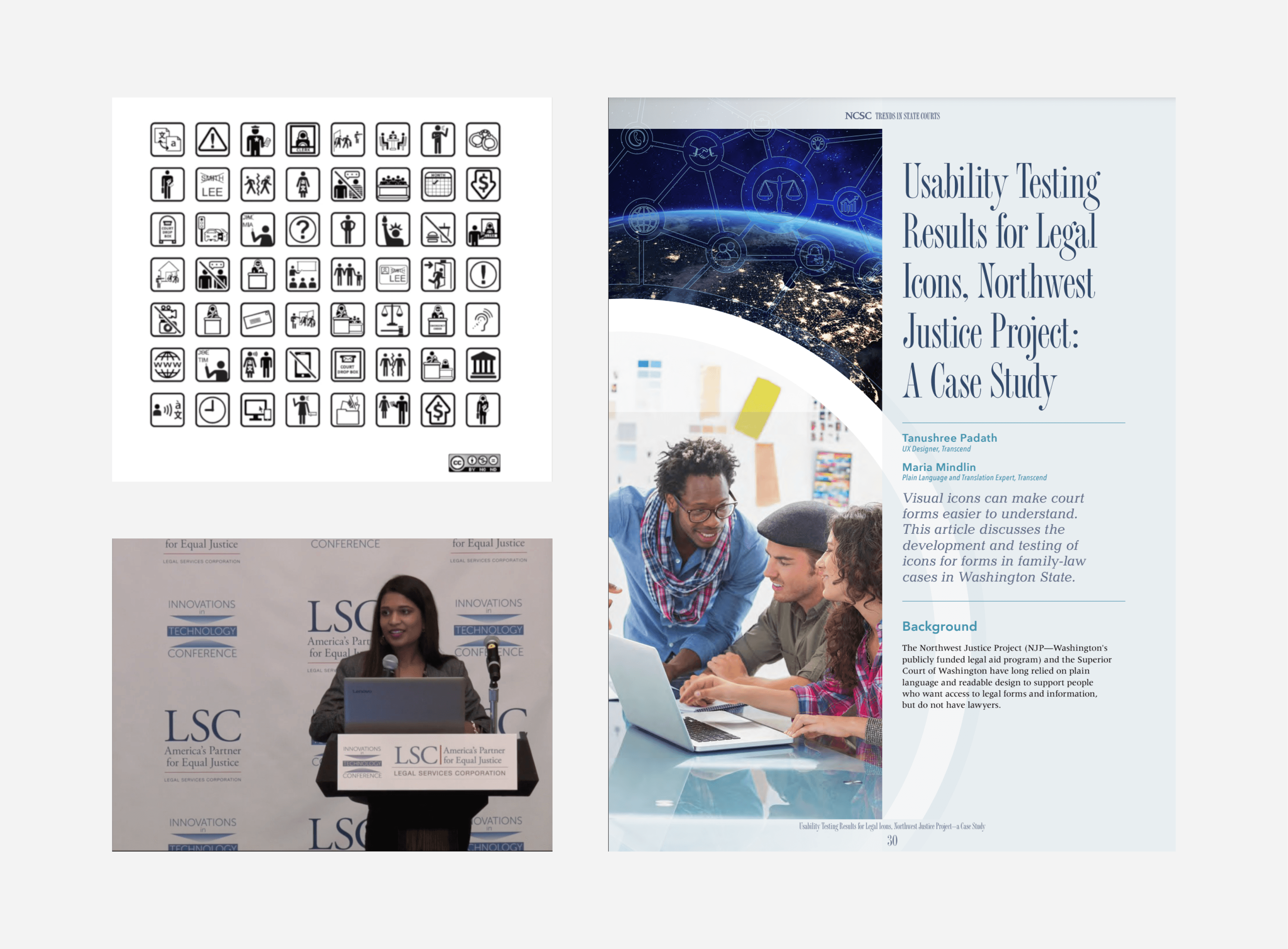
My team developed the first set of user-tested legal icons, a free resource that has helped numerous government workers create more readable documents. Our icon creation process was also featured in a court trends publication.

While our company primarily specializes in translation services, I was thrilled when our CEO approved this unique side project.

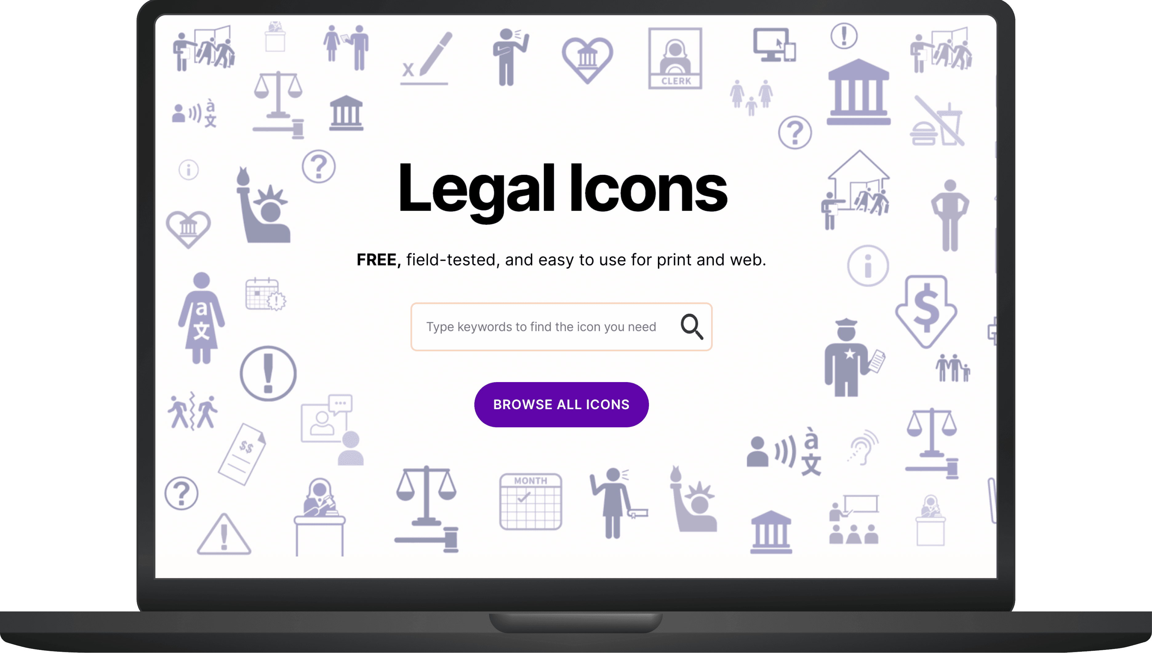
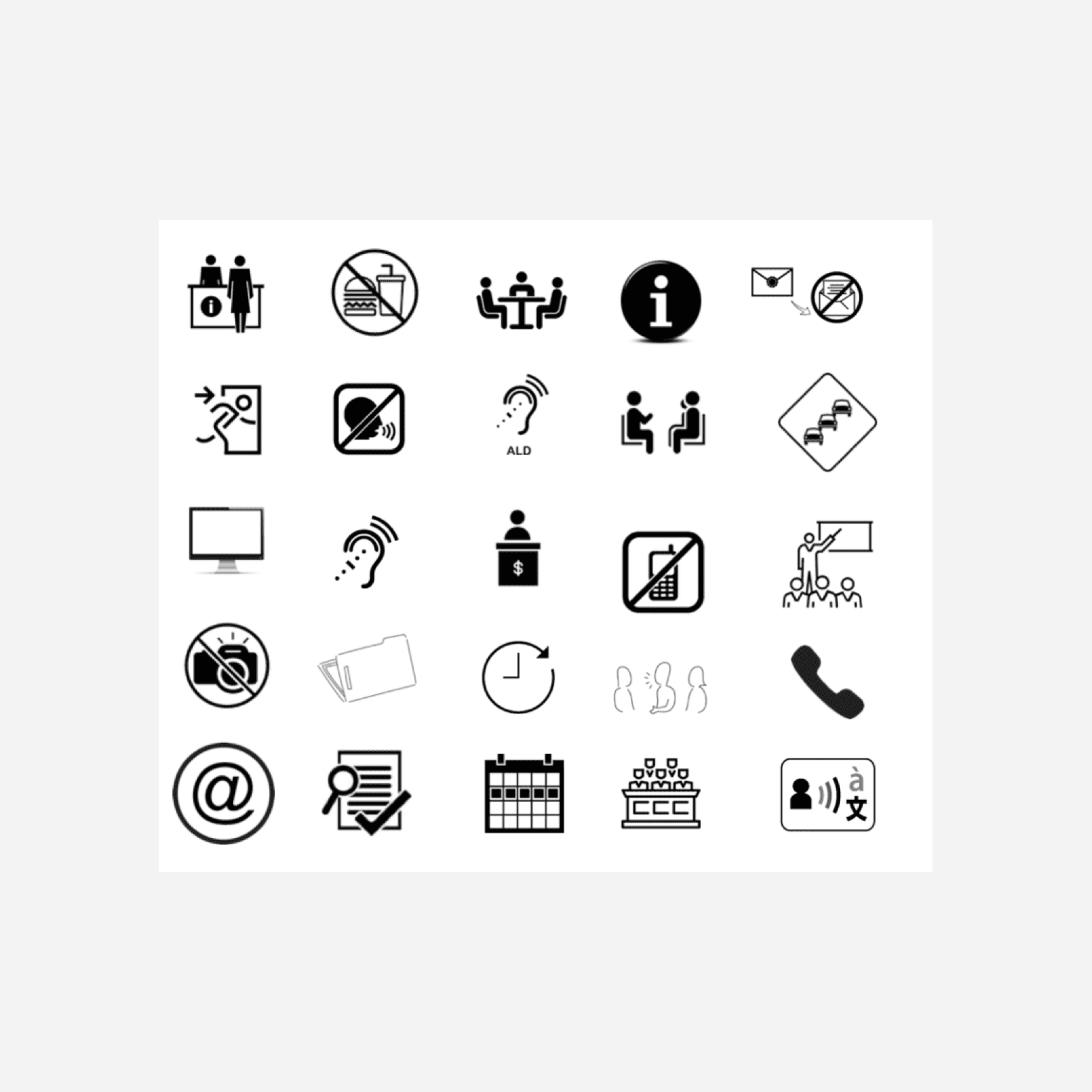
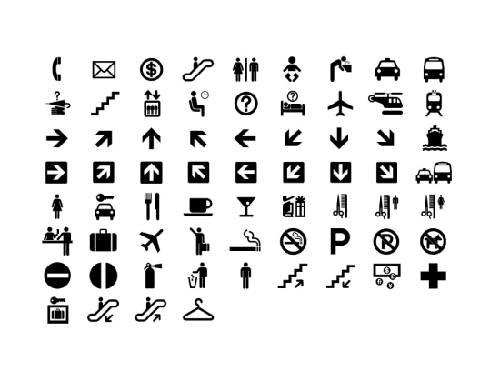
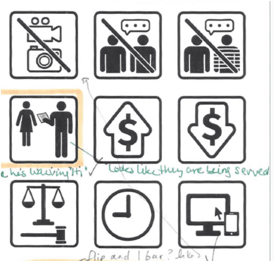
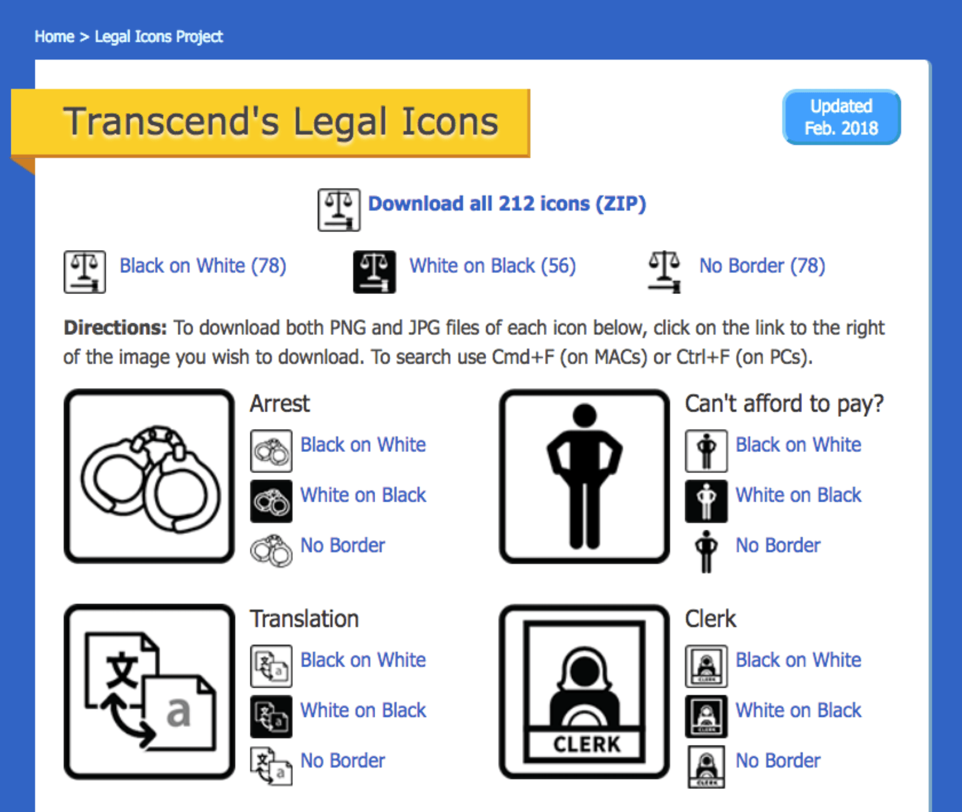
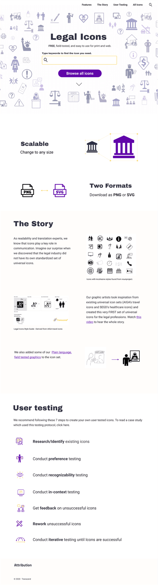
My team created over 100 user-tested icons, housed in a searchable website, in two phases.

Phase 1:

Initial Icon Set and Recognition

  • 56 user-tested icons uploaded to a static website.

  • I presented our research and icons at a Legal Tech Conference.

  • This increased company visibility and generated requests for additional icons from the legal community.
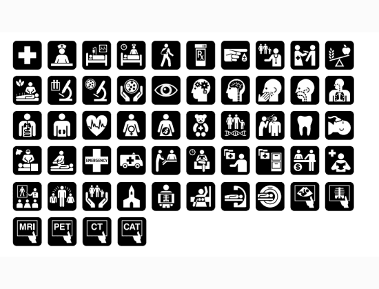
Phase 2:

Expansion and Website Redesign

  • Led the creation and user testing of 59 more icons.

  • Led the redesign of the website for the icon website.

  • I co-authored a case study which was published in the National Center for State Courts' Trends in State Courts magazine.

Poster showing the completed icon set, Tanushree, an indian woman, presenting at the Innovations in Technology Conference, and the front page of the publication, Usability Testing Results for Legal Icons, Northwest Justice Project: A Case Study

What were the steps we took to get here?

The Design Process

Research Phase

First, there was secondary research

Analysis of universally recognizable icon sets

In my research, I found two sets of user-tested universal icons. In both sets, the teams used a human centered design process to translate abstract terms into visual artifacts.

Travel icons poster - shows around 50 icons in a grid
Travel Icons (first set of universal icons)

In the 1970s, The American Institute of Graphic Arts (AIGA) in partnership with the Department of Transportation created 50 icons to be used at transportation hubs. Modern icons are based on this set.

Health icons poster - shows around 50 icons in a grid
Healthcare Icons (based on travel icons)

Based on the travel icons, in 2004, Hablamos Juntos collaborated with the Society for Environmental Graphic Design (SEGD) to create health care icons. They led co-design sessions with the community to create their icons.

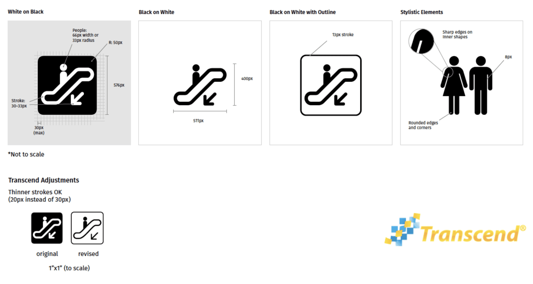
Developing a style guide for compatible iconography

Our senior designer developed a comprehensive style guide, based on the travel icon set, so that our icons could be easily combined with other free signage icon sets, providing users with a wider range of options for their signage needs.

A Transcend branded style guide that shows the pixel width and height, (400px), the stroke size and other specifications to be used for the legal icons

Iterations and User Feedback

The icons went through both an internal and external review based on design principles we selected.

Creating icons for abstract terms presents a unique challenge due to the subjective nature of visual interpretation. To streamline our process, we first vectorized Transcend's existing user-tested graphics and worked internally to come to a consensus. We then conducted recognizability testing on these vectors to ensure people still correctly matched the icon to its intended meaning.

Internal Review

Eviction icon with editor marks on it. One mark says, "change roof angle"
Team leads' design critiques

2 rounds of feedback from our design and plain language leads based on the adherence to style guide and the design principles below.

Visually Consistent

Racially Ambiguous

Gender Inclusive

External Review

9 icons in a 3x3 grid with user feedback comments. One comment says, "Looks likt they are being served"
Field testing with typical legal consumers

3 rounds of user testing with 10 participants from diverse backgrounds, age, genders who were asked - “What does this icon or picture mean to you?”. Icons were reworked until they were recognized by 70% or more of the participants.

Findings

Internal Review

Design critiques revealed issues with icon legibility, scalability, and complexity.
  • Legibility at Small Sizes: Some icons were illegible at small sizes due to excessive detail.

  • Scalability: Icon clarity and visual quality must be maintained across all sizes.

External Review

User testing on icon recognition revealed the need for contextual cues and culturally sensitive design practices.
  • Context is Key: Some icons required contextual cues for clear understanding, leading to further exploration of icon-text pairings.

  • Cultural Considerations: Diverse user testing highlighted the importance of cultural sensitivity in icon design, as interpretations varied across different groups.

Process at a glance: from concept to icon

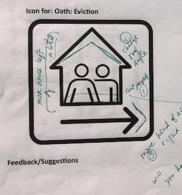
The eviction icon, for example, went through many iterations before it was recognizable.

A sketch showing a house with two people inside and a hand outside pointing to the right

Initial Sketch

Eviction icon with editor marks on it. One mark says, "change roof angle"

Vectorized Icon with internal feedback

Hi fidelity icon shows two people carrying suitcases leaving a door and someone outside holds a piece of paper and points out the door.

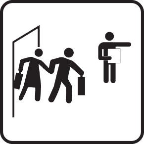
Final icon after field testing

Next, we focused on delivery

Icon Website

Website Redesign

Before

Initial design followed our company branding

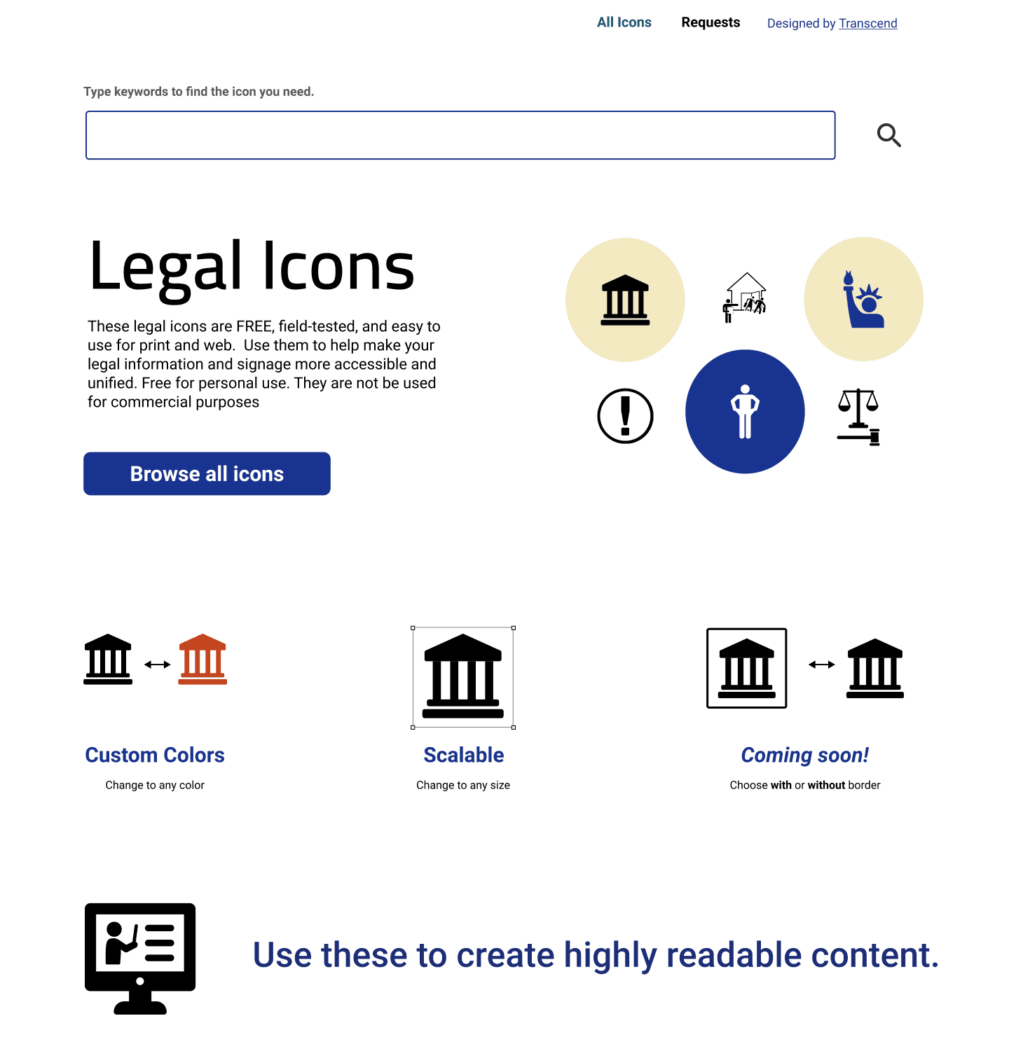
To leverage company resources, we created a landing page on our existing website where users could download individual icons in three formats. The branding and functionality matched our existing website.

Initial Transcend's Legal Icons homepage. Shows options to download all 212 icons, or 78 black on white, 56 White on black or 78 No border. The arrest, can't afford to pay, Translation, and Clerk icons are also visible for individual download

After

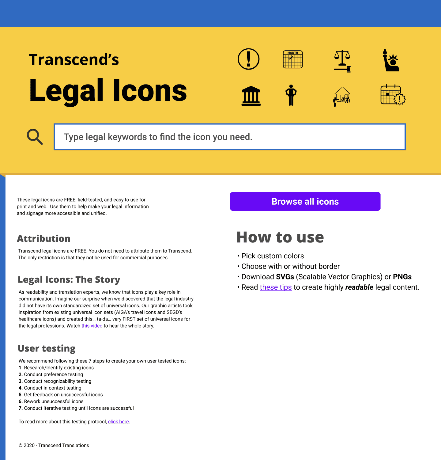
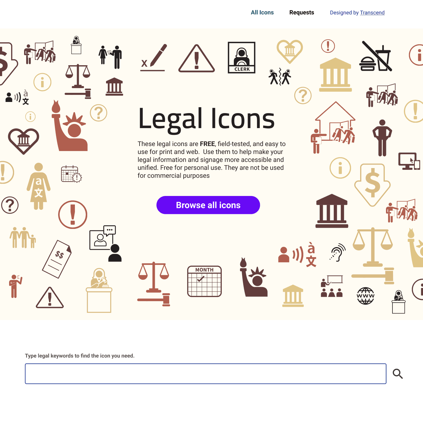
Based on customer feedback, I led the redesign of the website

A year after the website's launch, we conducted user feedback surveys to identify areas for improvement. Key requests included a search functionality and an expanded color palette. I led the user experience (UX) and interaction design efforts for the subsequent redesign.

Iterations

I created many iterations on Figma and worked with a Design Engineer to get feedback and implement changes

Legal icons homepage mockup - using Transcend's color scheme or mustard and blue
A second iteration of the homepage showing a more muted blue and yellow color scheme with more white space between elements
A homepage mockup shows the hero image which has multiple icons laid out in a random manner with the CTA "Browse all icons" in the middle

Feedback-Based Updates

Discoverability

Our research uncovered that some users preferred to browse through our complete collection or search for specific icons. Our interface accommodates both approaches.
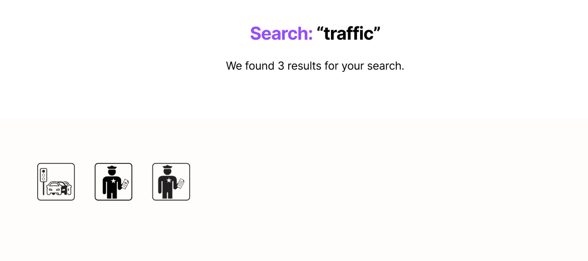
Example for "Search: Traffic". 3 search results are shown
Search

The search bar provides quick access to specific designs.
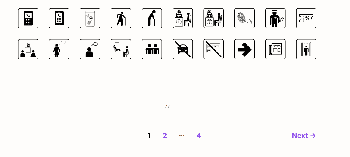
The browse screen shows 10 icons with arrows to navigate to more icons
Browse

The browse view allows users to explore the full library of available icons.

Customize for ease of use

Additionally, user research indicated a need for customizable icons to accommodate varying levels of technical experience. So, we created three custom features for each icon.

Choose any color

Users can select a color they prefer for each icon.

With or without border

Users can download the icon with or without a border.

PNG or SVG

While most users desired PNGs, some expert users also wanted the option to download scalable vectors.

Final Design

After numerous iterations, we finalized a modern, minimal aesthetic, prioritizing the icons as the focal point

Legal Icons home page preview

Impact

Since its launch, these icons have been adopted by numerous legal publications. The icons are freely available for use, and many professionals visit the site to download them for their own projects.

The "family" icon is shown on a publication titled, "Child Support Worksheets and Order"

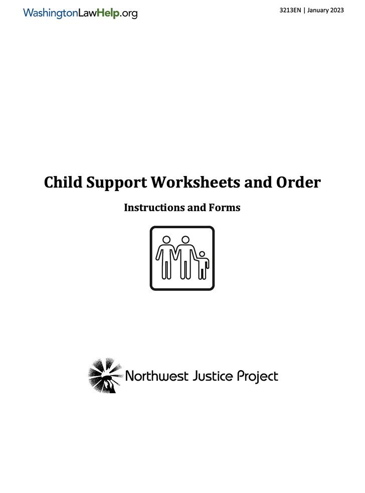
Northwest Justice Project (2023)

Uses our "Family Law" icon for one of their publications

Reflection

This project was developed by my team at Transcend Translations during our spare time, with the goal of offering a valuable free resource to the legal community. With more dedicated resources, we would have implemented more robust metrics to track usage and actively solicited user input on potential icon additions.

Despite being a side project, it became one of my most memorable experiences at Transcend. It not only provided a valuable resource to the legal community but also significantly increased the company's visibility.